A vector illustration portrait of Dimitar Georgiev - Metaka, branding specialist and designer
An outlined megaphone with radiating lines, symbolising broadcast, announcement, or amplification. Designed as a top layer to highlight messaging in presentations or landing pages.
A stylised spotlight shape for layered visual storytelling. Intended as a base layer to create dimensional lighting effects—works well under illustrations, icons, or key visuals.

See it, feel it, experience it

branding design without compromises

Portrait of Dimitar Georgiev with a glowing orange and yellow backdrop, wearing a black t-shirt with the Metaka logo.
Minimalist scroll indicator, ideal for hero sections or long-form pages. Encourages users to engage and explore further content. Designed with fluid web transitions in mind.

Go To My Portfolio

I develop strategic designs rooted in research and strategy, presented in a comprehensive branding guide for easy application. Covering everything from simple designs to complex systems.

Branding visuals and structure

Dive into a world where design meets strategy, showcasing projects that blend creativity with purpose.

Brand Message and Storytelling

Each project is a testament to thoughtful design and strategic thinking, crafted to inspire and engage.

Brand Positioning

Experience the art of branding through projects that highlight innovation and collaboration.

Portfolio

Dive into a curated selection of my most engaging projects, showcasing the art of branding and design.

Minimalist scroll indicator, ideal for hero sections or long-form pages. Encourages users to engage and explore further content. Designed with fluid web transitions in mind.

Skyrock - Brand Identity and Strategy for a Digital Growth Agency

Project Type: Branding, Strategy, Visual Identity / Industry: Digital Marketing / Year: 2024

Skyrock banner featuring the brand's logo, chess knight illustration, and slogan “We Skyrocket Tomorrow’s Unicorns.
A Brand Worth Hiring

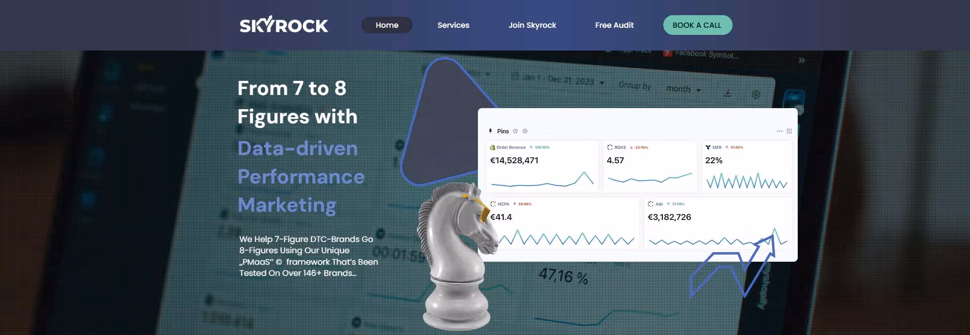
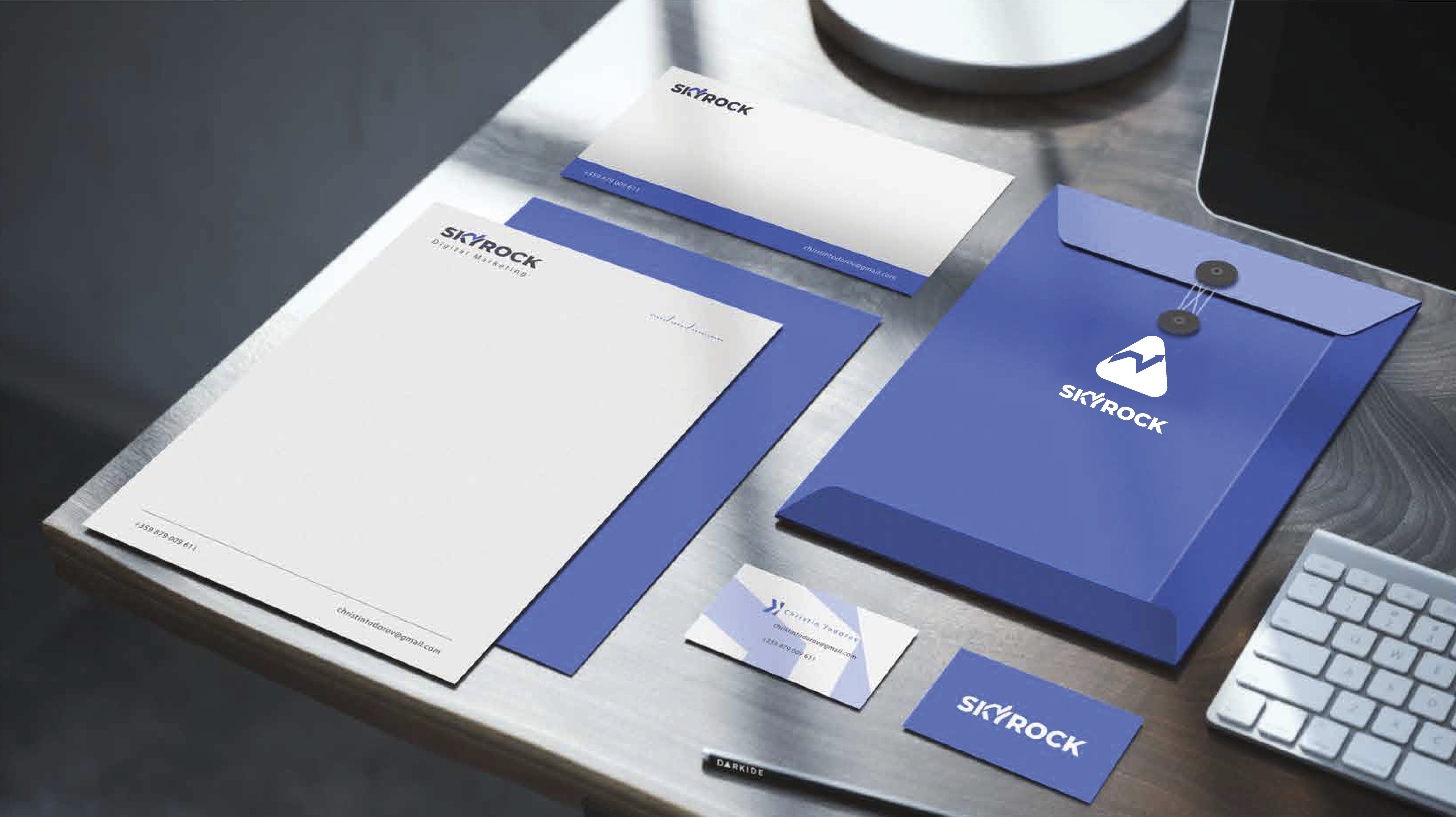
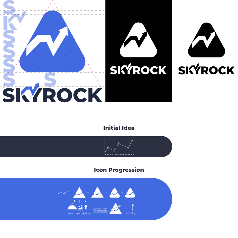
Skyrock didn’t need just a simple rebranding; they needed a full transformation that captured attention and fueled growth. Through strategy and design, I helped them become the agency their founder envisioned—a premium partner for high-investment clients. The brand speaks with authority, but to soften the serious, data-driven tone of the website, I introduced playful, humorous touches.

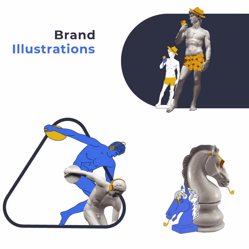
Inspired by the Vaporwave art movement, I incorporated reimagined classical and Greek statues—each with modern accents. These playful additions bring a sense of humanity, lightening the intensity of navigating a performance-focused marketing agency's website.

Skyrock logo reveal video. Short logo presentation in skyrock's brand colours
Stages of Skyrock’s logo design showing icon and typography development, from graph-based idea to refined branding.
Skyrock brand colour palette with CMYK, RGB, and HEX codes for primary and secondary tones.Stylised illustrations of classical statues with modern accessories, reflecting Skyrock’s Vaporwave-inspired brand theme.

Deliveribles:

Brand Core Development
Tone of Voice and Messaging
Visual Identity Design
Brand Guidelines Creation

Brand stationery mockup for Skyrock including letterhead, business cards, and branded envelope in blue.

The Challenge and the Vision

Skyrock was ready to evolve from a rising agency into a premium partner for major businesses. They needed a brand that matched their ambition.

I crafted a complete identity rooted in purpose, clarity, and emotional resonance, giving them the tools to attract and retain 100k+ monthly marketing clients.

Screenshot of Skyrock website homepage showcasing performance marketing data and a chess knight graphic.

The Outcome

Skyrock’s rebrand empowered them to reach higher-value clients and sustain major growth. Their CEO described the transformation best: "I feel like I want to hire myself." Today, Skyrock stands strong on the brand foundation we built together.

Visual Storytelling and Art Direction for a Heritage Skincare Brand

Role: Branding Photography & Art Direction Collaborator: Giuseppe Nkansah Industry: Luxury Skincare / Natural Beauty Year:2020

Nkuto brand banner featuring model holding shea butter jar in soft natural light.

Shea Butter, Seen Through the Soul

Nkuto is more than a skincare product—it’s a piece of Ghana’s natural heritage.
When Giuseppe Nkansah invited me to art direct this campaign, I focused on creating photography that felt timeless, grounded, and emotionally alive.
Each photo was crafted to celebrate softness, strength, and connection—with the natural world and with self-care.
Creative Direction of the Photo Series
On-Set Art Direction
Brand-Inspired Photography
Emotional Visual Narrative
Styled Mood Development
Color Palette and Visual Harmony Design

What I Delivered

Creative planning sketch for Nkuto shoot, featuring lighting diagram and composition.

The Challenge and the Vision

Nkuto’s product—a rich shea butter sourced from Ghana—needed more than clean photography.It deserved a story told in light, tone, and skin.

My goal was to design visuals that could speak across cultures—honoring its African roots while connecting with a modern, global audience.

Every shot was styled with intention: combining traditional elements, minimalist environments, and layered textures to evoke a ritual-like calm.
What emerged was a campaign that felt deeply tactile, honest, and emotionally moving.
Close-up of Nkuto’s shea butter jar placed on sand. Captures the organic and raw essence of the brand—perfect for product detail pages, hero sections, and ingredient storytelling.

The Outcome

The series helped reintroduce Nkuto as a sensual, meaningful experience - anchored in history, but designed for today’s skincare lovers.
The campaign was featured in several African publications, and continues to represent Nkuto as a brand of beauty, dignity, and grounding.

I was honoured to have some of my works published in African fashion magazines, Fourwall, in its special edition and Man's Fashion Africa. For me, this project wasn’t just a shoot—it was a collaboration built on trust, vision, and shared pride.

Teamo – Branding & Design for a Soulful Tea Experience

Luxury Tea Brand Identity and Packaging Design

TÉAMO Herbal Tea banner featuring logo and product shot on an elegant dark background.

More Than Tea  An Invitation to Special Moments

Teamo was never intended to be ordinary tea.
This is not tea for routine mornings or casual sips. Teamo exists for meaningful moments — those rare, intimate times when connection matters. It is a tea created to elevate occasions and to stand as a luxurious gesture, like a fine wine chosen carefully for a memorable dinner or an exquisite perfume selected to mark a meaningful evening.
Inspired by European herbal traditions, Teamo carries deep respect for nature’s gifts, but it presents them through the lens of elegance. Each herb — Chamomile, Cornflower, Lemon Balm, Mursala, and Rosehip — is expressed through its own icon and subtle colour, turning the blends into a curated experience, not just a product.

The Vision

We envisioned a brand that tells a story—where each element, from the logo to the packaging, speaks of tradition, care, and the intimate experience of enjoying a cup of tea. The design needed to bridge the gap between age-old practices and contemporary aesthetics.
Poster Video showing a couple with steam forming the TÉAMO logo, emphasising romantic storytelling.

My Creative Contribution

Brand Positioning and Strategic Direction
Brand Purpose, Vision, and Mission
Naming and Narrative Crafting
Logo and Visual Identity Design
Packaging Concept and System
Colour Palette and Iconography
Art Direction and Visual Storytelling

TÉAMO complete product range with assorted coloured tea boxes photographed on a gold tray.

Shaping Teamo From Thought to Emotion

Teamo is not tea for the masses. It's more... It's A Gift, A Gesture, A Memory.
It is tea for special people and special moments.

Positioned as a luxury and spiritual product, I shaped the brand's presence to feel rare, desirable, and deeply personal.
Like fine wine or rare fragrances, Tiamo invites people to pause, reflect, and connect. Through subtlety and depth, I created a brand that lives quietly, yet touches deeply.

Through this project, I transformed tea into an emotional experience and crafted a brand that elevates both the product and the moment it creates.
This project went beyond design.
I crafted Teamo from its very roots — from market research and strategic thinking to creating a holistic emotional and visual language.
Poster graphic showing a couple with steam forming the TÉAMO logo, emphasising romantic storytelling.